


6
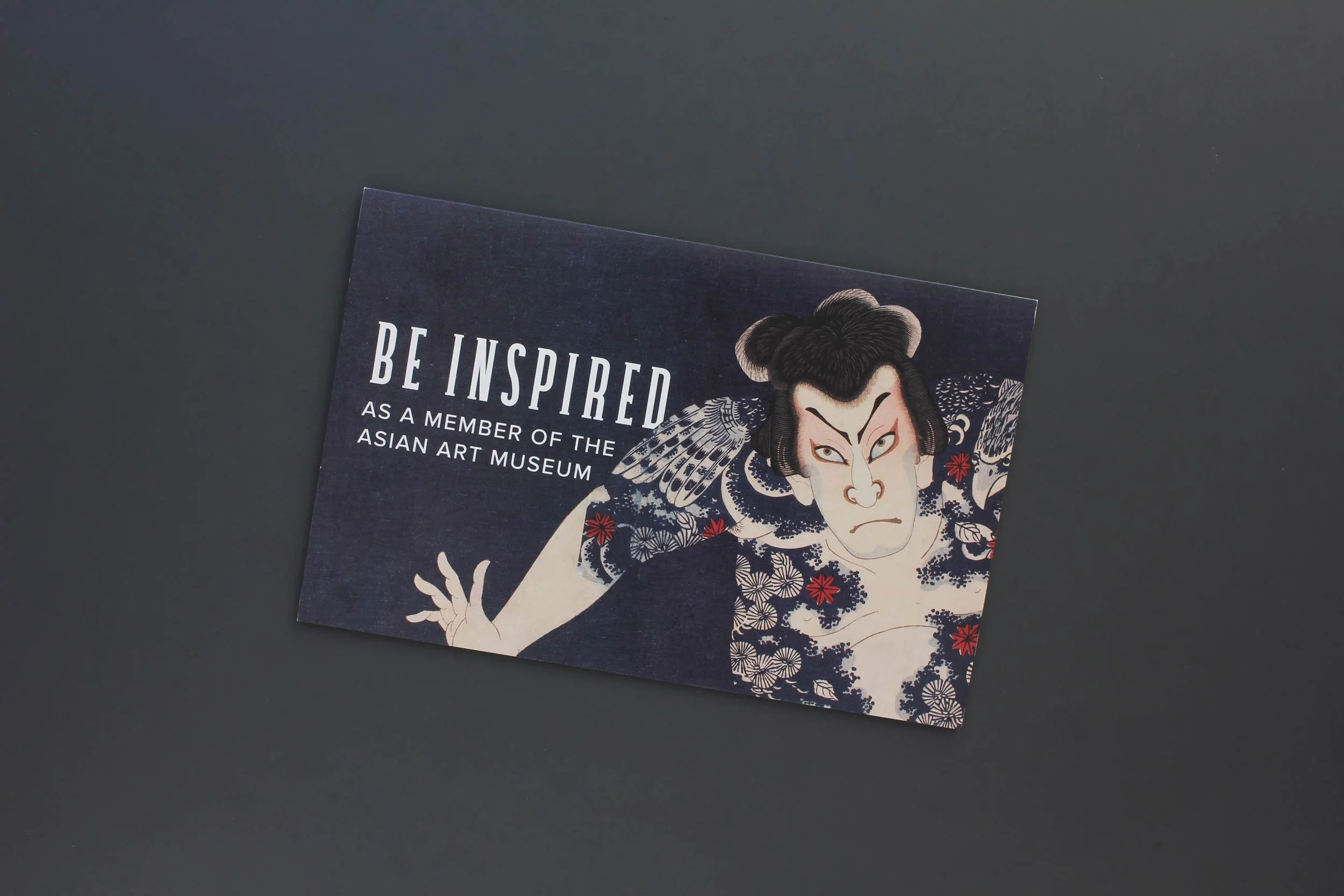
Membership and Development Collateral

9
Exhibition Creatives

4
The Asian Members' Magazine

1
New Member Cards
4
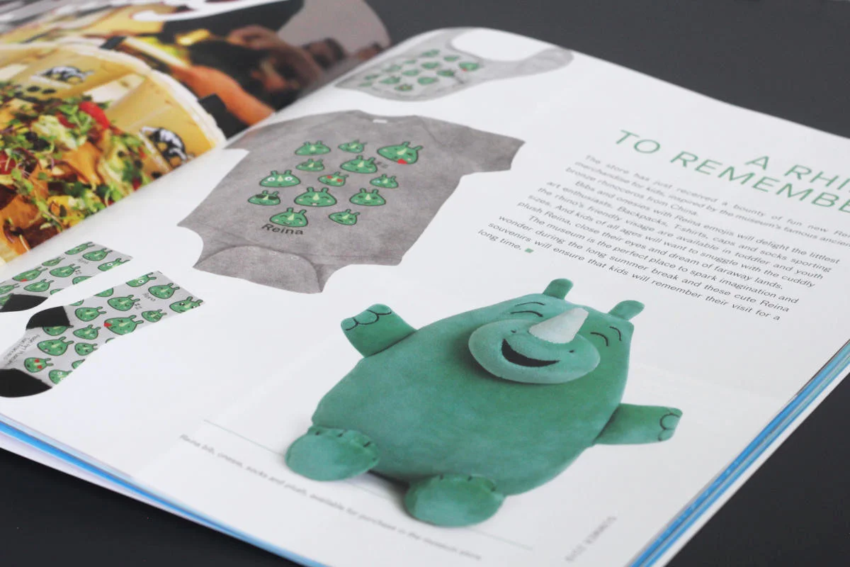
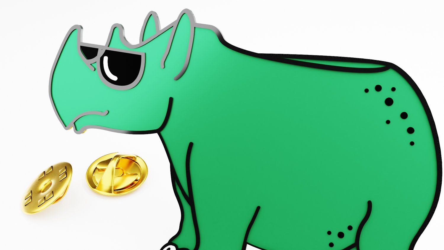
Reina the Rhino
5
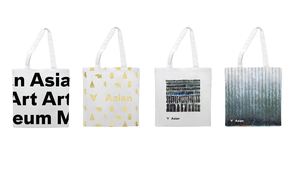
Membership Tote Bags

3
2019 Annual Nexus Dinner Invitation

3
The Sculptural Turn

2
Save the Date Leadership Event

4
2017 Annual Nexus Dinner Invitation

2
Double Decker Bus Ad

3
Thursday Nights